Sometimes, when building a native app, you may need to display a long (potentially infinite) list of complex, dynamic layouts. Think social media posts, modern instant messages, you get the idea. All these things where there are endless combinations of media attachments, link snippets, headers, footers, etc.
The straightforward solution is to use a RecyclerView or (UI|NS)CollectionView or whatever the equivalent is for your target platform with one item view per post. However, this comes with several drawbacks:
- It takes a lot of work to calculate the layout of such a complex view, resulting in stuttering scroll, especially on underpowered devices.
- It’s not easy to fully reuse such views, thus undermining the purpose of the list view. You have to balance between memory consumption (keeping all possible child views but only displaying the relevant ones) and CPU load (the garbage collector in Android is gonna bite you in the ass if you keep allocating and dereferencing too many objects too often).
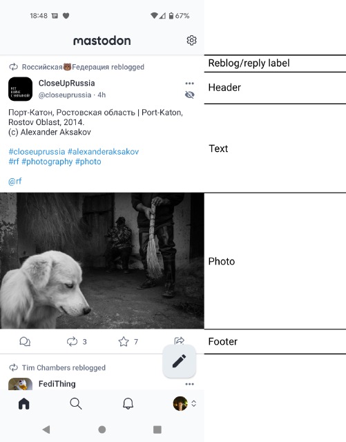
Instead, a much better approach is what I call “display items”. Here’s an image worth a thousand words:

The basic idea is that you slice your complex layout into smaller, easily reusable parts, and use each of these as a separate list item. You then only need a bit of hackery to make all display items comprising a single post highlight as a whole when clicked, but that really is it. The scrolling performance is buttery smooth even on a fricking Galaxy Nexus.
So far, I’ve used this approach in at least three projects, all of them Android apps: the VKontakte app, the Telegram TDLib-based contest app of 2016 (which later became the official WearOS app), and the Mastodon app.
If you wish to see the actual code implementing this approach in a real project, the Mastodon app is open-source! The display items themselves are here (the bulk of logic pertaining to the slicing is in the StatusDisplayItem base class), and the fragment (view controller) that displays them is this.