Lately, I started noticing a sad trend. Apps, websites and even operating systems disrespect their users more and more. What is this about, might you ask? Here’s what:
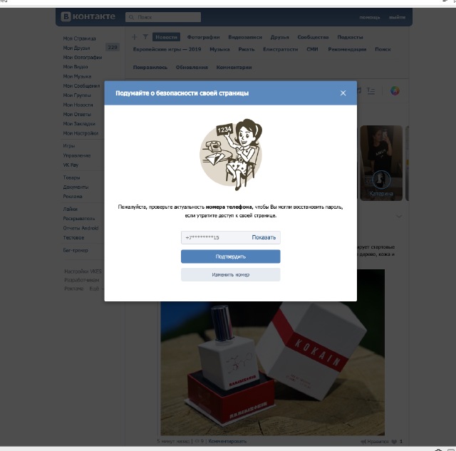
Yes, it’s these popups out of nowhere I’m talking about. Your task, as a software developer, is to make your users' lives easier. To help them do whatever they’re doing faster and more efficiently. By showing modal popups that have absolutely nothing to do with whatever they’re currently doing, you annoy them and get in their way. You’re not being helpful.
Even “the world’s most advanced mobile operating system” doesn’t respect its users. I unlocked my iPhone with a very specific intention, yet I got this:
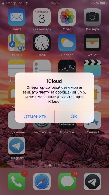
The most natural reaction in this case it to remove the annoyance with minimal effort and get back to whatever I intended to do. But it doesn’t work like this here: you press the home button but nothing happens. You have to pay attention to this shit, read the text, make a decision right here and right now and choose an option. It is surprising that the same Apple seems to be understanding this. It almost never shows any such windows on Mac OS, relying on the notification system instead. Yet on iOS, it annoys its users every time there’s an opportunity. Sometimes one might think they finally realized it and started using notifications for their extremely urgent communication on iOS as well:
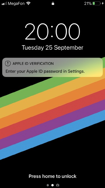
But, of course, everything falls back into place as soon as you unlock your device:
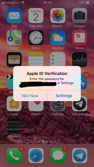
System updates are even worse. After you unlock it, you get a similar alert with “now” and “later” as options. If you tap “later”, it takes over your entire screen and asks for your passcode to “install it overnight”, with a barely noticeable cancel button at the bottom.
But then we have websites. Websites are the worst. Nearly each of them with articles on it considers it a necessity to have an email subscription. The subscription itself is nothing bad. What is bad, however, is these subscription form popups that block any page when you load it. This is my first time on your website. I clicked on a link someone sent me. I couldn’t care less which exact website this is, neither do I care what else does it have to offer. I’m here to read the letters and look at the images, and that’s it. That’s my only intention right now, and you’re interfering with it. Yet for some bizarre reason it is considered fine to treat your visitors like that.
How do you solve this problem? It’s surprisingly easy. Take a look at how Android handles system updates:
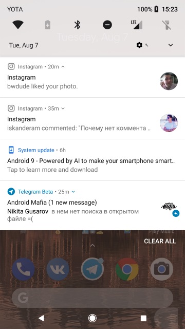
This is a simple notification. It doesn’t annoy you. It doesn’t try to forcibly switch your attention. It appears in the notification shade silently and waits for whenever it will be convenient for me to install the update. It’s the system that adapts to the user, not the other way around.
Another option to solve this is to use additional blocks or bars. This works for apps and websites. Whoever needs this will see it and act on it. Whoever doesn’t will ignore it. Everyone’s happy and no functionality is lost.
Respect your users, and your users will respect you.